Tips for Conversational Writing

Tips for Conversational Writing


In my two previous posts, I’ve been sharing some tidbits that I learned at the PRB Policy Communication Workshop. In my first post, I aimed to motivate you to think about the broader impacts of research, especially considering the unique role researchers play within the process of policy formation or change. In my second post, I discussed three different outlets–aside from academic journals–where researchers can share their findings with the public. This week, in my third and final post about policy communication, I will share some tips that I learned about conversational writing. Special thanks to Craig Storti for his enlightening presentation about some bad habits that I picked up in grad school!

Disclaimer: This blog post contains several cat puns. This may result in audible groaning and face-palming. Reader discretion is advised.

are-you-d2jfze

Academic Jargon and Dense Prose

It may seem obvious that we should avoid academic jargon when writing for non-technical audiences. As I said previously, abstract concepts such as macro- and micro-level processes or statistical methods are not well understood outside a specific discipline. We are also often told that we should stop using words such as ‘utilize’ when we could easily substitute ‘use.’ But even if we are acutely aware of these bad habits, here are two other occupational hazards that I did not consider before the workshop: 1) Nominalization and 2) Noun Compounds:

Nominalization is when we transform a verb into a noun. For example, nominalization  itself is a noun that was derived from a verb–i.e., ‘nominalize.’ Another example is the word ‘investigation’, which is from ‘investigate.’ Sentences that contain nominalized verbs can be weaker and less concise than sentences that use the actual verb.

A Noun Compound is when we use a consecutive string of two or more nouns in a sentence. For example, ‘Policy Communication Workshop Fellowship’ or ‘national community health operations research technical working group.’ Excessive use of noun compounds can result in dense writing that is difficult to understand.

Example

To demonstrate how easy it can be to both nominalize our verbs and string several nouns together, I wrote a hypothetical introduction to the cat meme inequality study<–noun compound!–that I used as an example in my previous post. Nominalizations are underlined; noun compounds are in red (excluding the phrase ‘cat meme’ alone); and jargon is in blue. Puns are italicized 🙂 :

Differences in purr household consumption of cat memes have been dramatically increasing over the past half-century, and research suggests that this growing disparity is due to incongrooment access to cat memes. Informed by this body of research, my study utilized data from the Cat Meme Survey of Households and Families and found that legislative pawlicies have, in part, catapulted these cat meme inequality access issues. Right meow, cat meme pawlicies are littered with supurrrfluous loopholes fur the rich and privileged. However, my research indicates that these catastrophic inequalities in cat meme access can be mitigated if pawlicymakers consider the implementation of laws or clawses that focus on the inadequacy of cat meme access fur more disadvantaged households through the creation of cat meme inclusion zones, which would allow fur the dissemination of more provisions fur those who are in need.

Tips for avoiding dense prose

The simplest way to avoid nominalizations is by restoring the verb. For instance, the first sentence of my example could be changed to “Rich households consume more cat memes than poor households…” Alternatively, the sentence could be changed to “Households are consuming cat memes at a different rate…” The latter example uses the gerund form of the verb.

The benefit of correcting nominalizations is that you will likely break up noun compounds, like I did in my first example:

Original: Differences in purr household consumption of cat memes have been dramatically increasing over the past half-century…

Corrected: Rich households consume more cat memes than poor households, which is a trend that has been increasing over the past half-century.

Another way to fix noun compounds is by including a preposition such as ‘of’, ‘in’, ‘to’, and ‘for’:

Original: However, my research indicates that these catastrophic inequalities in cat meme access can be mitigated if pawlicymakers consider the implementation of laws or clawses that focus on the inadequacy of cat meme access fur more disadvantaged households through the creation of cat meme inclusion zones, which would allow fur the dissemination of more provisions fur those who are in need.

Corrected: My research indicates that access to cat memes across households is inadequate. Policymakers should consider implementing laws that help more disadvantaged households gain access to cat memes. For example, by creating incentives to encourage builders and investors to provide more households with equal access to cat memes, or restricting builders and investors from accessing permits unless they agree to these terms, which is often referred to as “inclusionary zoning.”

It gets better with practice

I was surprised by how difficult it was to correct nominalizations and (especially) noun compounds at the workshop. I found that some of my resistance to removing noun compounds is that it can result in longer sentences. But unless I am writing for an academic journal, the value of writing more concisely is lost when my audience does not understand what I am writing about. It’s a skill that I will have to continue to practice and be more thoughtful about in the future. I encourage you to do the same!


Aiming Beyond Academic Journals: Where to share your research and what to consider.

Last week, I wrote about making your research more accessible to decision makers. I wanted to follow-up on this post and briefly cover three common mediums of public dissemination, at least among the academic circles that I am apart of: (1) Newspaper/Magazine articles; (2) Blogs; and (3) Policy Briefs. More about each outlet below:

Newspaper/Magazine articles: Publishing an article in a well-known magazine or newspaper is often a coveted achievement because of the level of exposure your research will receive. This will require careful and concise language, ranging between 700 to 1,000 words depending on the outlet. You will also need to come up with attention-grabbing headlines, and immediately open the article with your main message.

Carefully paying attention to your favorite articles is a great way to see this in practice. For example, here’s an article headline from the Washington Post that gets straight to the point: Antarctic ice loss has tripled in a decade. If that continues, we are in serious trouble. And this is the first sentence: “Antarctica’s ice sheet is melting at a rapidly increasing rate, now pouring more than 200 billion tons of ice into the ocean annually and raising sea levels a half-millimeter every year, a team of 80 scientists reported Wednesday.” The empirical study informing this Washington Post article is much more complicated. It focuses more on methods and the specifics of the researchers’ quantitative findings. The empirical article, as written, may not be well understood by non-technical audiences, but the findings and potential implications can still be highlighted such that any reader can understand what these scientists found and why it matters.

Note: op-eds are not the same as articles. They are about 750 words or less and they are based on your opinion; see this link and this link for tips on writing op-eds.

Blog Posts: Blogs are a great way of making your research accessible to niche audiences, and your article should be tailored according to their specific interests. However, make sure that your writing can still be easily understood by audiences who are unfamiliar with the general theme of the blog, keeping in mind that you want to increase readership. Posts should also be short, typically 500 to 800 words. Try to make the language conversational, meaning that you try to write like you speak, but be concise. Lastly, it’s always helpful to include visuals, such as photos or graphics. Graphics should be clearly explained or self-explanatory.

The topics and language featured in personal blogs is less strict, but I recommend writing professionally and cautiously, regardless. You never know who may read your blog and be offended, which may get you fired, set barriers for subsequent employment, and/or discredit you among important groups or decision makers.

My blog, for example, shares what I learn. I explain why I started this blog here. The benefit of sharing what I learn is that it forces me to clearly explain a topic or skill, which reinforces my learning and may help others who wish to learn the same thing. Plus, it invites feedback, which will help me to improve. I highly recommend it! Also, I have a running list of some of my favorite blogs here.

Policy Briefs: Policy briefs are typically aimed at policymakers or advocacy groups who are interested in a specific topic. These can be bit longer, typically 4 pages or less and between 1,500 to 2,000 words. It should provide a concise overview of a specific issue and recommendations for action. Make sure the recommendation is supported by credible research and identify who should perform this recommended action. Implications and recommendations should also be made in the introduction of the policy brief. For example, here’s a policy brief by PRB: Enhancing Family Planning Equity for Inclusive Economic Growth and Development. The implications and recommendations are highlighted in the last sentence of the first paragraph: “Lack of economic opportunity can produce multigenerational cycles of poverty, threaten social cohesion and stability, and even reduce economic competitiveness, but countries can achieve inclusive growth by implementing strategies that promote “broad-based expansion of economic opportunity and prosperity.” You can see that PRB clearly outlined what was at stake and also made a clear call to action. I recommend reviewing more policy briefs to see other examples.


The main takeaway is that when you look to share your research in different public outlet, make sure to consider the general format associated with publishing in through that medium. The format is very different from what I have a learned in grad school. It will definitely take a lot practice, but as an additional incentive, this kind of writing, especially the policy brief, is great for grants!

Stay tuned for an upcoming blog post on tips for effective communication for non-technical audiences!

Links to more resources:

UNC Writing Center: What is a policy brief

The Guardian on News Writing

Books by Craig Storti on Communicating Across Cultures

Inside Higher Ed: Communicating Research to a General Audience


Collecting Twitter Data using the twitteR package in Rstudio

Collecting Twitter Data using the twitteR package in Rstudio

Last week, I wrote a blog post about collecting data using Tweepy in Python. Like usual, I decided to recreate my work in R, so that I can compare my experience using different analytical tools. I will walk you through what I did, but I assume that you already have Rstudio installed. If not, and you wish to follow along, here’s a link to a good resource that explains how to download and install Rstudio.

Begin by loading the following libraries–download them if you don’t have them already installed.

#To download:
#install.packages(c("twitteR", "purrr", "dplyr", "stringr"),dependencies=TRUE)

library(twitteR)
library(purrr)
suppressMessages(library(dplyr))
library(stringr)

Next, initiate the OAuth protocol. This of course assumes that you have registered your Twitter app. If not, here’s a link that explains how to do this.


api_key <- "your_consumer_api_key"
api_secret <-"your_consumer_api_secret"
token <- "your_access_token"
token_secret <- "your_access_secret"

setup_twitter_oauth(api_key, api_secret, token, token_secret)

Now you can use the package twitteR to collect the information that you want. For example, #rstats or #rladies <–great hashtags to follow on Twitter, btw 😉

tw = searchTwitter('#rladies + #rstats', n = 20)

which will return a list of (20) tweets that contain the two search terms that I specified:

RstatsRlaides

*If you want more than 20 tweets, simply increase the number following n=

Alternatively, you can collect data on a specific user. For example, I am going to collect tweets from this awesome R-Lady, @Lego_RLady:

Again, using the twitteR package, type the following:


LegoRLady <- getUser("LEGO_RLady") #for info on the user
RLady_tweets<-userTimeline("LEGO_RLady",n=30,retryOnRateLimit=120) #to get tweets
tweets.df<-twListToDF(RLady_tweets) #turn into data frame
write.csv(tweets.df, "Rlady_tweets.csv", row.names = FALSE) #export to Excel

Luckily, she only has 27 tweets total. If you are collecting tweets from a user that has been on Twitter for longer, you’ll likely have to use a loop to continue collecting every tweet because of the rate limit. If you export to Excel, you should see something like this:
Excel

*Note: I bolded the column names and created the border to help distinguish the data

If you’re interested in the retweets and replies to @LEGO_RLady, then you can search for that specifically. To limit the amount of data, let’s limit it to any replies since the following tweet:

target_tweet<-"991771358634889222"
atRLady <- searchTwitter("@LEGO_RLady", 
                       sinceID=target_tweet, n=25, retryOnRateLimit = 20)
atRLady.df<-twListToDF(atRLady)

The atRLady.df data frame should look like this:

atRlady

There’s much more data if you scroll right. You should have 16 variables total.

Sometimes there are characters in the tweet that result in errors. To make sure that the tweet is in plain text, you can do the following:

replies <- unlist(atRLady) #make sure to use the list and not the data frame

#helper function to remove characters:
clean_tweets <- function (tweet_list) {
  lapply(tweet_list, function (x) {
    x <- x$getText() # get text alone
    x <- gsub("&amp", "", x) # rm ampersands
    x <- gsub("(f|ht)(tp)(s?)(://)(.*)[.|/](.*) ?", "", x) # rm links
    x <- gsub("#\\w+", "", x) # rm hashtags
    x <- gsub("@\\w+", "", x) # rm usernames
    x <- iconv(x, "latin1", "ASCII", sub="") # rm emojis
    x <- gsub("[[:punct:]]", "", x) # rm punctuation
    x <- gsub("[[:digit:]]", "", x) # rm numbers
    x <- gsub("[ \t]{2}", " ", x) # rm tabs
    x <- gsub("\\s+", " ", x) # rm extra spaces
    x <- trimws(x) # rm leading and trailing white space
    x <- tolower(x) # convert to lower case
  })
}
tweets_clean <- unlist(clean_tweets(replies))
# If you want to rebombine the text with the metadata (user, time, favorites, retweets)
tweet_data <- data.frame(text=tweets_clean)
tweet_data <- tweet_data[tweet_data$text != "",]
tweet_data<-data.frame(tweet_data)
tweet_data$user <-atRLady.df$screenName
tweet_data$time <- atRLady.df$created
tweet_data$favorites <- atRLady.df$favoriteCount
tweet_data$retweets <- atRLady.df$retweetCount
tweet_data$time_bin <- cut.POSIXt(tweet_data$time, breaks="3 hours", labels = FALSE)
tweet_data$isRetweet <- atRLady.df$isRetweet

You can pull other information from the original data frame as well, but I don’t find that information very helpful since it is usually NA (e.g., latitude and longitude). The final data frame should look like this:

cleantweets

Now you can analyze it. For example, you can graph retweets for each reply

library(ggplot2)
ggplot(data = tweet_data, aes(x = retweets)) +
  geom_bar(aes(fill = ..count..)) +
  theme(legend.position = "none") +
  xlab("Retweets") +
  scale_fill_gradient(low = "midnightblue", high = "aquamarine4")
dev.copy(png,'myplot.png')
dev.off()

myplot

If you have more data, you can conduct a sentiment analysis of all the words in the text of the tweets or create a wordcloud (example below)

BigDataWordMap-1264x736

Overall, using R to collect data from Twitter was really easy. Honestly, it was pretty easy to do in Python too. However, I must say that the R community is slightly better when it comes to sharing resources and blogs that make it easy for beginners to follow what they’ve done. I really love the open source community and I’m excited that I am apart of this movement!

PS- I forgot to announce that I am officially an R-Lady (see directory)! To all my fellow lady friends, I encourage you to join!


US Fertility Heat Map DIY

US Fertility Heat Map DIY

The US fertility heat maps that I made a couple of weeks ago received a lot of attention and one of the questions I’ve been asked is how I produced it, which I describe in this post.

As I mentioned in my previous post, I simply followed the directions specified in this article, but I limited the UN data to the US. Overall, I think the article does a good job of explaining how they created their heat map in Tableau. The reason why I remade the heat map in R is because I was just frustrated with the process of trying to embed the visualization into WordPress. Both Tableau and WordPress charge you to embed visualizations in a format that is aesthetically pleasing. Luckily, recreating the heat map in R was extremely easy and just as pretty, at least in my opinion. Here’s how I did it:

First, download the data from the UN website–limit the data to the US only. Alternatively, I’ve linked to the (formatted) data on my OSF account, which also provides access to my code.

Now type the following in Rstudio:


#load libraries:
#if you need to install first, type: install.packages("package_name",dependencies=TRUE)
library(tidyverse)
library(viridis)

#set your working directory to the folder your data is stored in
setwd("C:/Users/Stella/Documents/blog/US birth Map")
#if you don't know what directory is currently set to, type: getwd()

#now import your data
us_fertility<-read.csv("USBirthscsv.csv", header=TRUE) #change the file name if you did not use the data I provided (osf.io/h9ta2)

#limit to relevant data
dta% select(Year, January:December)

#gather (i.e., "aggregate") data of interest, in preparation for graphing
dta%
arrange(Year)

#orderring the data by most frequent incidence of births
dta %>%
group_by(Year) %>%
mutate(rank=dense_rank(desc(births)))

#plot the data
plot<- ggplot(bb2, aes(x =fct_rev(Month),
y = Year,
fill=rank)) +
scale_x_discrete(name="Months", labels=c("Jan", "Feb", "Mar",
"Apr", "May","Jun",
"Jul", "Aug", "Sep",
"Oct", "Nov", "Dec")) +
scale_fill_viridis(name = "Births", option="magma") + #optional command to change the colors of the heat map
geom_tile(colour = "White", size = 0.4) +
labs(title = "Heat Map of US Births",
subtitle = "Frequency of Births from 1969-2014",
x = "Month",
y = "Year",
caption = "Source: UN Data") +
theme_tufte()

plot+ aes(x=fct_inorder(Month))

#if you want to save the graph
dev.copy(png, "births.png")
dev.off()

 
And that’s it! Simple, right?!

Understanding Linear Regression

My husband and I were discussing the intuition behind OLS regression today and I decided to share the materials that I generated to break down covariance, correlations, and the linear regression equation. It may help to follow along in the Excel workbook that I did this in (see link).

First, let’s say that we have the following data:

Y X1 X2
1 40 25
2 45 20
1 38 30
3 50 30
2 48 28
3 55 30
3 53 34
4 55 36
4 58 32
3 40 34
5 55 38
3 48 28
3 45 30
2 55 36
4 60 34
5 60 38
5 60 42
5 65 38
4 50 34
3 58 38

We plot the relationship between each X variable and Y, to get a visual look at their relationships:

x1y

x2y

I also like to look at the relationship in a 3D plot (this plot was made in Rstudio with plotly–see link for tutorial):

//plot.ly/~allets/6.embed

To calculate the mean of these data, we would have to sum each column and divide each column by the total number of observations (n=20):

Sum 65 1038 655
N 20 20 20
Mean 3.25 51.9 32.75

Now we need the standard deviation. This is something most students do not find very intuitive unless you force them to calculate this step by step, either by hand or in Excel. You should start by subtracting each observation in each column by it’s respective mean:

(Y-MeanY) (X1-MeanX1) (X2-MeanX2)
1-3.25=-2.25 40-51.9=-11.9 25-32.75=-7.75
2-3.25=-1.25 45-51.9=-6.9 20-32.75=-12.75
1-3.25=-2.25 38-51.9=-13.9 30-32.75=-2.75
3-3.25=-0.25 50-51.9=-1.9 30-32.75=-2.75
2-3.25=-1.25 48-51.9=-3.9 28-32.75=-4.75
3-3.25=-0.25 55-51.9=3.1 30-32.75=-2.75
3-3.25=-0.25 53-51.9=1.1 34-32.75=1.25
4-3.25=0.75 55-51.9=3.1 36-32.75=3.25
4-3.25=0.75 58-51.9=6.1 32-32.75=-0.75
3-3.25=-0.25 40-51.9=-11.9 34-32.75=1.25
5-3.25=1.75 55-51.9=3.1 38-32.75=5.25
3-3.25=-0.25 48-51.9=-3.9 28-32.75=-4.75
3-3.25=-0.25 45-51.9=-6.9 30-32.75=-2.75
2-3.25=-1.25 55-51.9=3.1 36-32.75=3.25
4-3.25=0.75 60-51.9=8.1 34-32.75=1.25
5-3.25=1.75 60-51.9=8.1 38-32.75=5.25
5-3.25=1.75 60-51.9=8.1 42-32.75=9.25
5-3.25=1.75 65-51.9=13.1 38-32.75=5.25
4-3.25=0.75 50-51.9=-1.9 34-32.75=1.25
3-3.25=-0.25 58-51.9=6.1 38-32.75=5.25

Then you will square each value in each column:

(Y-MeanY)^2 (X1-MeanX1)^2 (X2-MeanX2)^2
-2.25^2=5.0625 -11.9^2=141.61 -7.75^2=60.0625
-1.25^2=1.5625 -6.9^2=47.61 -12.75^2=162.5625
-2.25^2=5.0625 -13.9^2=193.21 -2.75^2=7.5625
-0.25^2=0.0625 -1.9^2=3.60999 -2.75^2=7.5625
-1.25^2=1.5625 -3.9^2=15.21 -4.75^2=22.5625
-0.25^2=0.0625 3.1^2=9.610000 -2.75^2=7.5625
-0.25^2=0.0625 1.1^2=1.21 1.25^2=1.5625
0.75^2=0.5625 3.1^2=9.610000 3.25^2=10.5625
0.75^2=0.5625 6.1^2=37.21 -0.75^2=0.5625
-0.25^2=0.0625 -11.9^2=141.61 1.25^2=1.5625
1.75^2=3.0625 3.1^2=9.610000 5.25^2=27.5625
-0.25^2=0.0625 -3.9^2=15.21 -4.75^2=22.5625
-0.25^2=0.0625 -6.9^2=47.61 -2.75^2=7.5625
-1.25^2=1.5625 3.1^2=9.610000 3.25^2=10.5625
0.75^2=0.5625 8.1^2=65.61 1.25^2=1.5625
1.75^2=3.0625 8.1^2=65.61 5.25^2=27.5625
1.75^2=3.0625 8.1^2=65.61 9.25^2=85.5625
1.75^2=3.0625 13.1^2=171.61 5.25^2=27.5625
0.75^2=0.5625 -1.9^2=3.60999 1.25^2=1.5625
-0.25^2=0.0625 6.1^2=37.21 5.25^2=27.5625

If you sum up each column of the squared values, you will get the standard deviation:

SD 29.75 1091.8 521.75

In addition to calculating the mean and standard deviation of Y, X1, and X2, you will also need to calculate the relationships between Y, X1, and X2 by first, multiplying them together, and then repeating each of the steps that we did above:

X1*Y X2*Y X1*X2
1*40=40 1*25=25 25*40=1000
2*45=90 2*20=40 20*45=900
1*38=38 1*30=30 30*38=1140
3*50=150 3*30=90 30*50=1500
2*48=96 2*28=56 28*48=1344
3*55=165 3*30=90 30*55=1650
3*53=159 3*34=102 34*53=1802
4*55=220 4*36=144 36*55=1980
4*58=232 4*32=128 32*58=1856
3*40=120 3*34=102 34*40=1360
5*55=275 5*38=190 38*55=2090
3*48=144 3*28=84 28*48=1344
3*45=135 3*30=90 30*45=1350
2*55=110 2*36=72 36*55=1980
4*60=240 4*34=136 34*60=2040
5*60=300 5*38=190 38*60=2280
5*60=300 5*42=210 42*60=2520
5*65=325 5*38=190 38*65=2470
4*50=200 4*34=136 34*50=1700
3*58=174 3*38=114 38*58=2204

Again, (1) sum each column and (2) divide by the total number of observations (n=20) to get the mean.

Sum 3513 2219 34510
N 20 20 20
Mean 175.65 110.95 1725.5

(3) In a separate table, subtract the respective mean for each column from each row value:

(X1*Y)-(MeanX1*Y) (X2*Y)-(MeanX2*Y) (X1*X2)-(MeanX1*X2)
40-175.65=-135.65 25-110.95=-85.95 1000-1725.5=-725.5
90-175.65=-85.65 40-110.95=-70.95 900-1725.5=-825.5
38-175.65=-137.65 30-110.95=-80.95 1140-1725.5=-585.5
150-175.65=-25.65 90-110.95=-20.95 1500-1725.5=-225.5
96-175.65=-79.65 56-110.95=-54.95 1344-1725.5=-381.5
165-175.65=-10.65 90-110.95=-20.95 1650-1725.5=-75.5
159-175.65=-16.65 102-110.95=-8.95 1802-1725.5=76.5
220-175.65=44.35 144-110.95=33.05 1980-1725.5=254.5
232-175.65=56.35 128-110.95=17.05 1856-1725.5=130.5
120-175.65=-55.65 102-110.95=-8.95 1360-1725.5=-365.5
275-175.65=99.35 190-110.95=79.05 2090-1725.5=364.5
144-175.65=-31.65 84-110.95=-26.95 1344-1725.5=-381.5
135-175.65=-40.65 90-110.95=-20.95 1350-1725.5=-375.5
110-175.65=-65.65 72-110.95=-38.95 1980-1725.5=254.5
240-175.65=64.35 136-110.95=25.05 2040-1725.5=314.5
300-175.65=124.35 190-110.95=79.05 2280-1725.5=554.5
300-175.65=124.35 210-110.95=99.05 2520-1725.5=794.5
325-175.65=149.35 190-110.95=79.05 2470-1725.5=744.5
200-175.65=24.35 136-110.95=25.05 1700-1725.5=-25.5
174-175.65=-1.650000 114-110.95=3.05 2204-1725.5=478.5

(4) Square those values for the standard deviation:

(X1*Y)-(MeanX1*Y)^2 (X2*Y)-(MeanX2*Y)^2 (X1*X2)-(MeanX1*X2)^2
-135.65^2=18400.9225 -85.95^2=7387.4025 -725.5^2=526350.25
-85.65^2=7335.9225 -70.95^2=5033.9025 -825.5^2=681450.25
-137.65^2=18947.5225 -80.95^2=6552.9025 -585.5^2=342810.25
-25.65^2=657.9225 -20.95^2=438.9025 -225.5^2=50850.25
-79.65^2=6344.1225 -54.95^2=3019.5025 -381.5^2=145542.25
-10.65^2=113.4225 -20.95^2=438.9025 -75.5^2=5700.25
-16.65^2=277.2225 -8.95^2=80.1025 76.5^2=5852.25
44.35^2=1966.9225 33.05^2=1092.3025 254.5^2=64770.25
56.35^2=3175.3225 17.05^2=290.7025 130.5^2=17030.25
-55.65^2=3096.9225 -8.95^2=80.1025 -365.5^2=133590.25
99.35^2=9870.4225 79.05^2=6248.9025 364.5^2=132860.25
-31.65^2=1001.7225 -26.95^2=726.3025 -381.5^2=145542.25
-40.65^2=1652.4225 -20.95^2=438.9025 -375.5^2=141000.25
-65.65^2=4309.9225 -38.95^2=1517.1025 254.5^2=64770.25
64.35^2=4140.9225 25.05^2=627.5025 314.5^2=98910.25
124.35^2=15462.9225 79.05^2=6248.9025 554.5^2=307470.25
124.35^2=15462.9225 99.05^2=9810.9025 794.5^2=631230.25
149.35^2=22305.4225 79.05^2=6248.9025 744.5^2=554280.25
24.35^2=592.9225 25.05^2=627.5025 -25.5^2=650.25

(5) Now sum up each column for the standard deviation:

SD 135118.6 56918.95 4279623

Comprehensively, you should get a table like this:

Y X1 X2 X1*Y X2*Y X1*X2
Sum 65 1038 655 3513 2219 34510
N 20 20 20 20 20 20
Mean 3.25 51.9 32.75 175.65 110.95 1725.5
SD 29.75 1091.8 521.75 135118.6 56918.95 4279623

Now we can derive the covariance between each variable, as well as the correlation, using these formulas:

Such that your table should look like this:

y X1 X2
Y 29.75 139.5 90.25
X1 0.77 1091.8 515.5
X2 0.72 0.68 521.75

Notice that the numbers in the diagonals (blue) are the standard deviations that we calculated. The numbers in the bottom triangle (underlined) represent the correlation, and the numbers in the top triangle (red) is the covariance. Below, I show you how I calculated each value in each cell (in Excel):

y X1 X2
Y 29.75 3513-(1038*65)/20=139.5 2219-(655*65)/20=90.25
X1 139.5/SQRT(1091.8*29.75)=0.77403 1091.8 515.5
X2 90.25/SQRT(521.75*29.75)=0.724 515.5/SQRT(1091.8*521.75)=0.683 521.75

Now, you can calculate the betas for X1 and X2 using these formulas:

Notice that you are standardizing each variable by accounting for its covariance with the other predictor. Plugging in each value, you should get the following:

b1 (521.75*139.5-515.5*90.25)/(1091.8*521.75-515.5^2)=0.086
b2 (*1091.8-521.75*515.5)/(0.683*-521.75^2)=0.088

Remember that the formula for OLS regression is simply:

So, using algebra, plug in the variables to calculate the constant:

a 3.25-(0.086*51.9)-(0.088*32.75)=-4.104

Now we have our regression equation:

Y’=4.104 – 0.086*X1 – 0.088*X2 

Now we can calculate our column for y-hat by plugging each X1 and X2 value into the equation. You should get a column that looks something like this:

Y’
1.54282
1.536857
1.80801
2.844918
2.496897
3.276963
3.454552
3.802573
3.711394
2.331235
3.977777
2.496897
2.412873
3.802573
4.059415
4.409822
4.760228
4.841867
3.195325
4.237004

Now you can plot the actual Y versus predicted Y (i.e., Y’):

Yyhat

There you have it! Hopefully this breakdown provides a better intuition of the numbers behind the OLS regression formula!

My Custom R Package!

One thing that drives me crazy: Copying latent class model results from Mplus, pasting them into Excel, and then filtering out the parts of the output that are unnecessary. You can of course speed this process up by using vLookups or some form of indexing on Excel, but it’s still cumbersome. I’m spoiled by Stata, which has custom packages that allow the user to output their results into nicely formatted tables see for example my previous posts.

My solution? Make my own package that does this for Mplus output. I considered doing this in Stata, but I need to wean myself off of Stata and become proficient in programs like R and Python. So, I chose R. I didn’t do this for any particular reason other than that I am taking courses in Python, so I wanted to get more practice in R.

How it works

1. Install the package

If R is not installed on your computer, the first step is actually to install R. In addition to installing R, I recommend installing R Studio, which provides a friendly user interface for R, especially if you’re uncomfortable coding in a command prompt type window.

If R is installed on your computer, go to my github profile and download the LCA2xl_0.0.1.tar.gz file. Place the file in your R library. For example, my R library is “C:/Users/Stella/Documents/R/win-library/3.4”. Then type the following:

#First check that your working directory is set to the same folder you just placed the package in:
getwd()
#--If it isn't, type the following (replace with the correct information):
setwd('C:/Users/Username/Rpath')

#Second, install the package and load it:
install.packages("LCA2xl_0.0.1.tar.gz", type="source", repos=NULL) 
library(LCA2xl)

#You may also want to load the following packages:
library(dplyr)
library(tidyr)
library(plyr)
library(stringi)
library(stringr)
library(excel.link)
#--if you need to install them, type: install.packages("package_name", dependencies=TRUE)

2. Load your data

Next, tell R which Mplus.out file you would like to use. (Change your working directory to the correct folder first):

mplusfile<-"example.out"
#Alternatively, you can just use the "example.out" file directly in the function command. Shown below.

#Do not type the following. I am only doing this to give you have an idea of what the file looks like (for a 2 Class Model):
readLines(file("example.out"))

file

As you can see, it’s a massive file of text that you have to hunt through for the data that you want.

3. Use LCA2xl to extract models

The main function that you will likely want to use is getPScaleResults. This will get the section of the output file that displays the results in probability scale. The section that is relevant is Category 2 for each variable/measure, because this is the probability that the person in this class exhibits a particular trait or, in my case, the probability that a person will experience a particular event. The information you will need in order to use this function, is the usevariable list and the number of classes in the model. Note that you don’t have to provide a usevariable list. It’s better if you do however, because Mplus often truncates variables, or because your variables have nondescriptive names to prevent Mplus from truncating them. If you are okay with your usevariable names that you listed in Mplus, you can use an optional function that I created, called getUsevars. Here’s an example:

#To use the custom function that I provided:
usevars<-getUsevars(mplusfile) #it extracts the list you provided in Mplus
#--you could also just write: usevars<-getUsevars("example.out")

usevars #to view the results
 [1] "CUREMP2" "NSCHOOL2" "COHAB2" "MARRIED2" "PARENT2" "CUREMP3" "NSCHOOL3" 
 [8] "COHAB3" "MARRIED3" "PARENT3" "CUREMP4" "NSCHOOL4" "COHAB4" "MARRIED4" 
[15] "PARENT4" "CUREMP5" "NSCHOOL5" "COHAB5" "MARRIED5" "PARENT5" "CUREMP6" 
[22] "NSCHOOL6" "COHAB6" "MARRIED6" "PARENT6" "CUREMP8" "NSCHOOL8" "COHAB8" 
[29] "MARRIED8" "PARENT8" "CUREMP12" "NSCHOOL12" "COHAB12" "MARRIED12" "PARENT12" 
#Alternatively, you can assign a list. Just be sure to assign the same number of variables and in the correct order
usevars2<-c("EMPLOYED2","SCHOOL2", "COHAB2", "MARRIED2", "PARENT2", 
            "EMPLOYED3","SCHOOL3", "COHAB3", "MARRIED3", "PARENT3",
            "EMPLOYED4","SCHOOL4", "COHAB4", "MARRIED4", "PARENT4",
            "EMPLOYED5","SCHOOL5", "COHAB5", "MARRIED5", "PARENT5",
            "EMPLOYED6","SCHOOL6", "COHAB6", "MARRIED6", "PARENT6",
            "EMPLOYED7","SCHOOL7", "COHAB7", "MARRIED7", "PARENT7",
            "EMPLOYED8","SCHOOL8", "COHAB8", "MARRIED8", "PARENT8")

usevars2
 [1] "EMPLOYED2" "SCHOOL2" "COHAB2" "MARRIED2" "PARENT2" "EMPLOYED3" "SCHOOL3" 
 [8] "COHAB3" "MARRIED3" "PARENT3" "EMPLOYED4" "SCHOOL4" "COHAB4" "MARRIED4" 
[15] "PARENT4" "EMPLOYED5" "SCHOOL5" "COHAB5" "MARRIED5" "PARENT5" "EMPLOYED6"
[22] "SCHOOL6" "COHAB6" "MARRIED6" "PARENT6" "EMPLOYED7" "SCHOOL7" "COHAB7" 
[29] "MARRIED7" "PARENT7" "EMPLOYED8" "SCHOOL8" "COHAB8" "MARRIED8" "PARENT8" 
#Now you can extract the results in probability scale
results1<-getProbResults(mplusfile, classes=2, usevariableList=usevars)
#Don't worry about the red text. It's just a warning. I didn't assign attributes to the file. It's unnecessary information and it won't effect your results.
results1 #The results are put into a data frame (dataset)

#You will see pretty similar results if you use your custom variable list
results2<-getProbResults(mplusfile, classes=2, usevariableList=usevars2)
results2

Here is what each data set looks like:

results1

results2

Notice that I extracted the indicator (the number following the variable) and also added stars to the estimates: *** p<.001 **p<.01 *p<.05

4. Export the results to Excel

Now you can export the results to an Excel workbook. You also have to option of exporting both models results, if you would like:

listr<-list(results1) #It has to be in list to work
LCA2xl(modelList=listr, returnfile="Results1.xlsx")

#or you can create a list of models to export to Excel:
listresults<-list(results1, results2) #place both data frames in one list
listresults
LCA2xl(modelList=results1, returnfile="Results2.xlsx")

When you run the LCA2xl function, you’ll notice that an Excel Workbook will open on your computer. For the workbook with two models, you should see that each model was saved to a separate sheet.

Excel

5. Extras

Lastly, I added some extra functions: functions that extract Tech 11 and Tech 14 output, a function that extracts the average probability of class membership, and a final option that will take the square root of the results in probability scale. The latter function is mainly for graphing–it scales the y-axis. Below, I’ve provided a demonstration of each function.

#For Techoutput
getTech11(mplusfile, classes=2)

getTech14(mplusfile, classes=2)

sqprobLCA(mplusfile, classes=2, usevariableList = usevars)

extract_LCprob(mplusfile, classes=2)

tech11

tech14

sqprob

probs

You can add these results to the list of dataframes that you export to Excel if you would like them included in your results.

That’s it! Now go have fun with all that extra time you saved!

More Teaching Resources for GLM

I finally got a chance to go through all of my old Stata materials that I made for a GLM class and prepare them for sharing with a broader audience. These files include a tutorial on logistic regressionevent history analysis, count variables, and ordered logistic/probit regression. I was pleased to find all of the supplementary materials that I made for some of these topics, which I also included. For example, I forgot that I created a document (see Supplementary_Material) that shows the user how to find a package in Stata if the standard “ssc install” command doesn’t work. This document also includes an explanation of how to copy and paste the Stata results into Excel, and then separate the data into columns (see ugly gif below for preview of what I mean):

giphy

You should be able to view all of the materials that I shared by going to my OSF profile. For a detailed explanation of what I include in my tutorial, see my previous post on OLS Regression in Stata.

OLS Tutorial in Stata Cont.

This post is an addendum to the OLS tutorial I posted two weeks ago. I will walk through the explanations that I provided in the program and I will interpret the output. If you haven’t read the previous post, you can access the materials using this link.

The tutorial begins by telling the user to run the following two lines of code:

clear all

set more off, permanently

The “clear” command will clear out data, along with any value labels, that are currently loaded in Stata. The additional command “all” will clear matrices, scalars,
constraints, clusters, stored results, sersets, and Mata functions and objects from the memory, in addition to closing all open files and postfiles, clear the class system, close any open Graph windows and dialog boxes, drop all programs from memory, and reset all timers to zero.

The next command, “set more off,” changes Stata’s default setting, which is “set more on.” The “set more off” command tells Stata not to pause or display the ” –more–” message when showing results. Personally, I hate pressing spacebar over and over again until all of my results are displayed.  Stata will make “set more off” the new default by adding the option (noted by the “,”) “permanently.” Note that once you run this command, you do not have to run it again, now that “set more off” is the default. You can change this back by typing “set more on, permanently”. You can read more about the clear function here and the set more off function here.

In the next step, the tutorial directs you to load your data:

use “[folder path data is in]\[datafile name]”

I stored my data in the folder “C:\Users\Stella\Documents\blog\ols”. This should be put in place of the text:”[folder path data is in]”, including the brackets. The file name is “nlsy97_2015”. This should be put in the place of the text: “[datafile name]”, including brackets, such that the final will read:

use “C:\Users\Stella\Documents\blog\ols\nlsy97_2015”

You could add the option “,clear” to this instead of using the “clear all” command above, and it would effectively accomplish the same thing.

Next, I walk through how to set up a log file. A log records your Stata session. You can run multiple logs at the same time if you wish. It’s nice to keep a log of your work so that you can track what syntax was used to generate your output. In the program, I store the log in the same folder as my data. I name my log SMnlsy97_2015.txt. I add the option “replace” to allow Stata to write over an existing log, if there is one. You generally want to do this because it is likely that you will make mistakes and have to re-run your program.

In the next section of the program, I walk you through commands that allow you to look at your variables. For example, I look at the variable Wage, which is the outcome variable in this tutorial:

codebook Wage

This will produce the following output:

codebook

As you can see, codebook will show you information about the variable, such as the type of variable it is (numeric), the lowest value (0) and highest value (110,000), the number of unique values (400), the number of missing values (1400), the mean (40209), the standard deviation (27211.2), and the interquartile range. If you ran the command “codebook” without specifying a variable or variables, it would produce output for every variable in the dataset.

You can view a summary of the variable by typing:

summarize Wage, detail

For short, you can type “sum” in the place of summarize and “d” in the place of detail. This command should produce the following output:

sum

The output confirms some of the details we saw using codebook: The smallest value for Wage is $0, while the largest is $110,000; the mean wage is $40,209.03, with a standard deviation of $27.211.23. Unlike codebook, summarize shows us that there are 5,702 observations for the variable Wage; the median value, represented by the 50th percentile, is $36,000; and we can now see that the data is skewed. The value associated “skewness” tells us the degree and direction in which the data is skewed, which is skewed to the right (indicated by the positive value). Note that we can tell that the variable is skewed because the mean exceeds the median. Kurtosis is a measure of how heavily the data is skewed–heavily skewed data will show a value greater than 3. See UCLA IDRE for a detailed explanation.

You can view a visual representation of the variable by creating a histogram:

histogram Wage, normal

histogram

The “normal” option produces a bell curve that approximates what a normal distribution would look like. You can see that the distribution of Wage is not normally distributed. The bars spike above the curve and fall far below the curve throughout the distribution of wage Values (x-axis). Then you can see that there is a sudden spike again in the tail around the wage $150,000, where I top coded the wages.

It is generally expected that you run descriptive statistics on all of your variables. More on this in a second. First, you should check your variables for missing observations. There are several ways to do this. One way to do this is with the command misstable summarize. Note that you can specify which variables to look at (e.g., misstable summarize variable1 variable2…). By default, the command will look at all variables in the data. In the case of these data, that is okay because I’ve shortened the dataset to contain less than 20 variables. The result should be this:

misstable

You should see the variables that have missing observations, and the number of observations that are missing. For example, the variable mar_stat has 161 missing observations, whereas the variable biokids has 2,331. The table also reveals the number of unique values associated with each variable, along with the min and max values. The latter results can be observed in the summary table or if you use the command “tabulate”, which will produce frequency tables.

Another way to do this is with the command “mdesc”, which is a user-submitted command that tells Stata to generate a table that shows the missing values:

mdesc

The screen capture doesn’t show the results for all of the variables because it is cut off in my screen, but you get the idea. Again, by default, mdesc will run through all the variables in the dataset, unless you specify certain variables. Instead of showing you the number of unique values, and the lowest and highest values, mdesc shows you the percent that are missing, in addition to the total number of missing observations. I generally find this more helpful than the results produced by misstable summarize.

Next, I walk through different ways to address missing values. In the class that I made this tutorial for, replacing the missing values with the mean or mode was acceptable, as long as the student explicitly stated so. More advanced users will likely use methods such as multiple imputation (e.g., Stata13 Manual). You can also listwise delete any observations that contain missing values. I provide an example of a loop that will do this:


foreach

Most users find this confusing, so bear with me. The command says that “foreach” variable represented by some letter or word–in this case “v’–of the following varlist (aka “var”) *–which is short hand for all variables in this data. Stata is going to drop the observation if it missing. For example, the first variable in the example data is id. Stata will go through id and see if any of the values are missing. No values of id are missing, so Stata will go to the next variable (birth_month) and check for missing variables, and so on. When Stata gets to mar_stat, Stata will see that 161 people did not report their marital status, so Stata will remove them from the data, which will reduce our sample down to  6,941 observations (7,102-161). Then Stat will remove 2,331 observations for missing data on the number of biological children that they have, and so forth. In the end, you should have 3,623 observations. You can check this by running mdesc again.

Side note: Sometime in the future, I will provide a tutorial on loops because it is huge time saver, and it’s something that is not often taught in statistics courses (at least not in any of mine).

Continuing on with the tutorial, in the next section, I show the user how to generate formatted tables with a user-submitted command “estout”:

ssc install estout

You can add the option “replace” to update estout, if you’ve already installed the command. You can read more about the command by visiting this link. Now type the following:

estpost sum *

esttab usingC:\Users\Stella\Documents\blog\ols\OLSdescripts.rtf”, replace ///
cell((mean(label(Mean/Perc.) fmt(%9.2f)) sd(par label(S.D.) fmt(%9.2f)))) label nonumber nomtitle

eststo clear

The command “estpost” will show the results associated with whatever function you tell Stata to run on the data, in this case, I requested a summary of all my variables, as indicated by the asterisk (*). It will produce the following output:

estpost

The first column shows you the number of observations; the second shows the summary of weights (i.e., nonmissing observations); the third column shows you the mean of each variable; the fourth shows the variance; the fifth shows the standard deviation; the sixth shows the minimum value; the seventh shows the maximum value; and the last shows the sum of the variable. For descriptive statistics, we are interested in are: the mean, standard deviation, and the total number of observations. We use this information specifically in the next command which tells Stata to create a table (esttab) using this file location (C:\Users\Stella\Documents\blog\ols\) and this file name (OLSdescripts.rtf). I specify .rtf (rich text format) because I want to preserve the format. I use the option replace because I want to replace any existing document with this name. If you do not want to do this, simply change the name of the document (for example, OLSdescript2.rtf). Next, I tell Stata that I want the first cell (i.e., column) to display the mean, which should be labeled “Mean/Perc.” The label will be right justified and the numbers will show include two decimal places. The next cell/column will display the standard deviation, labeled as “S.D.” with the same formatting constraints. The next label option tells Stata that you want the labels associated with each variable, and to avoid adding the additional model number over each column that esttab adds by default. You should get the following output

Table
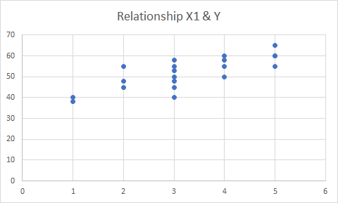
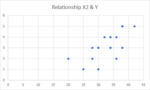
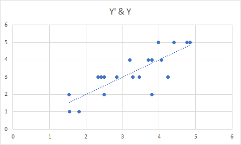
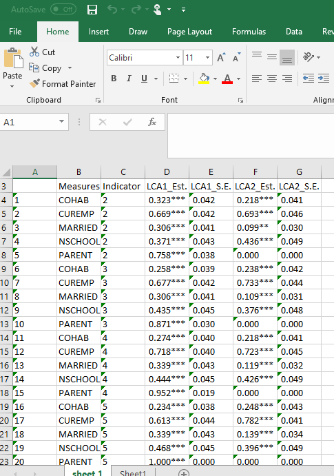
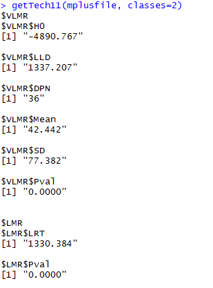
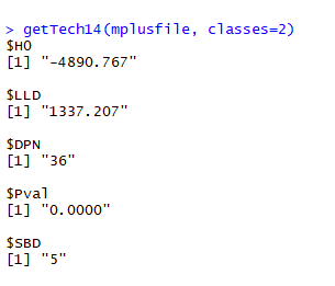
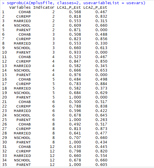
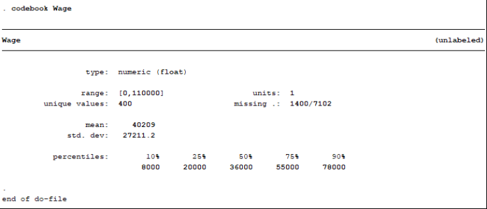
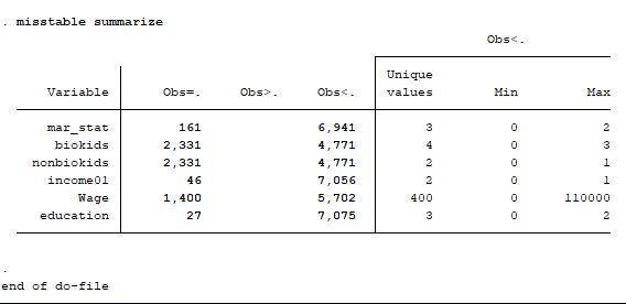
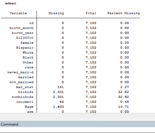
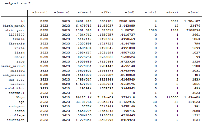
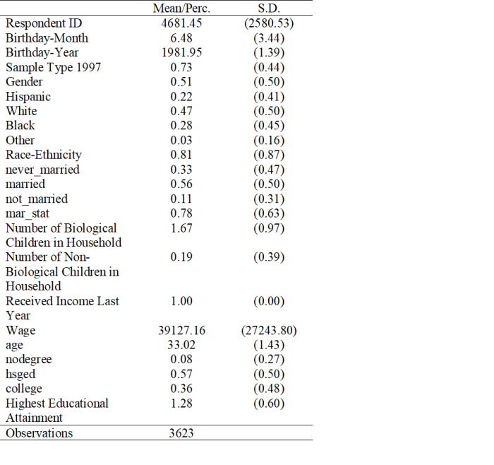
Note that not all of the variables are labeled. You will want to do this before you submit an assignment or use the table in a research paper.

You can also use esttab to generate formatted regression tables:

OLS
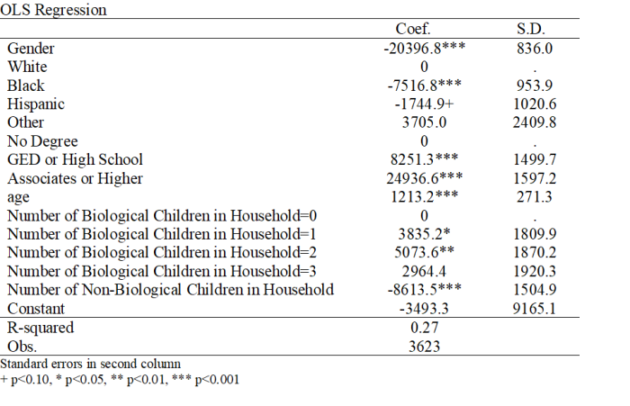
I show you how to do this toward the end of the program, after I go through quick explanations of how to check basic OLS assumptions.

A final note about the formatted results. Although esttab is a quick and easy way to create formatted tables within Stata, the user-submitted command tabout will give you even more control over how your results are displayed, especially if you know how to use LaTex. I spent a lot of time tinkering with LaTex and I never mastered it. Maybe a project for the future.

OLS Regression in Stata

I thought I would share some Stata programming files that I made for some students who were struggling with coding in a statistics course. The program covers OLS regression in Stata and references (mostly 2015) data from the National Longitudinal Study of Youth 1997 (NLSY97).  You can access the Stata programs and data set that I created from the Open Science Framework, using this link. I also included all of the original files, and a program that shows you how I coded the data set that is referenced for this tutorial.

The program assumes that the user has some basic Stata coding knowledge, such as coding variables, loading and saving data, and generating descriptive statistics. The program also does not cover how to interpret the results from the OLS regression. Instead, the program mostly focus on exporting descriptive statistics and OLS regression results to formatted tables within Word. They also describe in detail, how to conduct sensitivity analyses on the results. The reason I do not spend time explaining how to interpret the results is because there are already a ton of websites that do a great job of this; for example, see this detailed explanation at IDRE at UCLA. Instead, I offer ways to speed up the user’s productivity by exporting pre-formatted tables and I also provide a supplemental explanation of what the syntax is doing. This way, new users will not get hung up on learning to code in Stata, but instead, focus on learning more about the statistical concepts they are practicing.

For example, I provide comments after almost every line to explain what the syntax does specifically. I also walk the user through how to load data and save a log, which will also show the results of any model that the user runs. The reason why I specifically include explanations such as “[folder path data is in]\ [datafile name]” is because I found that some students were not familiar with what this line was doing. 

Pic1

For users who are not familiar with folder locations on the computer, you will have to include an additional step: showing how to copy and paste the folder path into the Stata program (illustrated by the highlighted folder address in the image below):

folderpath

When you are very comfortable with a computer, it’s easy to forget sometimes that this may be a totally foreign concept to someone who does not understand folder locations in a computer, which is a serious barrier to keeping up in statistics courses.

Basically, if the course is about programming in Stata, then of course, students should go through the steps for learning the syntax. If the course is about statistical concepts, and does focus on teaching the basics of programming, then I think it is important to provide more detailed explanations of what the syntax is doing.

With that said, the program that I provided is not perfect, but it certainly goes further than the typical explanation a student receives in a statistics course. I hope to improve it as I receive feedback from others. If you have any suggestions in how to do this, please let me know! Also, please feel free to share it with others or use it in your class, if you find it useful.