
Sharing a visualization that I made with Python, in Jupyter Notebook.
First, import the following libraries:
# Set up libraries
%matplotlib notebook

import matplotlib.pyplot as plt
import numpy as np
import seaborn as sns
sns.set_style("white")
import pandas as pd
my_dpi=96
Then import data and make scatter plots for each year of life expectancy data, courtesy of Gapminder:
# Get Gapminder Life Expectancy data (csv file is hosted on the web)
url = 'https://python-graph-gallery.com/wp-content/uploads/gapminderData.csv'
data = pd.read_csv(url)
# Transform Continent into numerical values group1->1, group2->2...
data['continent']=pd.Categorical(data['continent'])
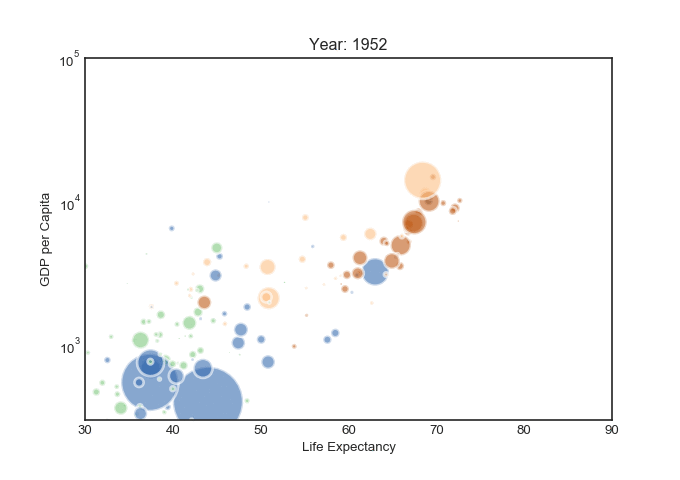
# For each year:
for i in data.year.unique():
# initialize a figure
fig = plt.figure(figsize=(680/my_dpi, 480/my_dpi), dpi=my_dpi)
# Change color for the x-axis values
tmp=data[ data.year == i ]
plt.scatter(tmp['lifeExp'], tmp['gdpPercap'] , s=tmp['pop']/200000 , c=tmp['continent'].cat.codes, cmap="Accent", alpha=0.6, edgecolors="white", linewidth=2)
# Add titles (main and on axis)
plt.yscale('log')
plt.xlabel("Life Expectancy")
plt.ylabel("GDP per Capita")
plt.title("Year: "+str(i) )
plt.ylim(0,100000)
plt.xlim(30, 90)
# Save the results
filename='Gapminder_step'+str(i)+'.png'
plt.savefig(filename, dpi=96)
plt.gca()
Next, download and install ImageMagick to make the following gif, by typing in your (Windows 10) command prompt:
magick convert.exeGapminder*.png animated_gapminder.gif
–If you have any issues configuring ImageMagick, like I did, you may find this link useful.
Note: You can make a gif using Matplotlib or moviepy, but I couldn’t quite figure it out. I will update once I do.
